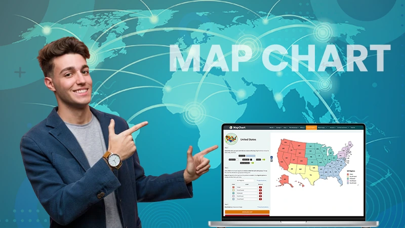
Visual reports have become an integral part of data analysis in various sectors. One of the best ways to represent complex information is a map chart.
There are different digital tools available that can create a diversified report and present your stats in a precise and informative way. From 3D models to simplifying with color coding and numbers, the possibilities are endless.
In this article, we will look into the concept and optimization of a map chart, explore scenarios where it is applicable, give examples of its usage, and finally discuss how you can leverage it.
The Fundamentals of a Map Chart

A map chart, also known as a geographic heat map, provides a way of visualizing location-specific information on an actual atlas. It is frequently used in geography-related or travel-oriented sectors to present data-based insights better.
For instance, a business can use it to visualize its sales distribution across different regions. This visual presentation allows the viewer to understand the information quickly and easily, as the report’s impact and relevance are immediately evident.
Sometimes, scoring locations is also undertaken by these sketches. These scores can be based on various characteristics like population density, natural hazards, or sales volume. The goal is to give a comprehensive perspective of spatial information.
Overall, by giving an immediate visualization of geography-coupled stats, map charts have become an indispensable tool in today’s data-rich world.
The Anatomy of a Map Chart: How It Operates
Creating a map chart begins with a blank geographic atlas. The selected content is then coded into a color system where different shades symbolize different stat levels.
For instance, a darker color might represent a higher value, while a lighter color might indicate a lower one. This presentation throws light on trends and patterns that might not be immediately visible in raw data.
A geographical design’s function might seem straightforward, but creating one requires deep understanding and careful execution. It involves significant decisions regarding how to embody the content, opting for the color scheme, and deciphering the stat’s level of granularity.
Ultimately, the success of a location-specific sketch heavily relies on precise execution and thoughtful representation of data.
EXPERT TIP
The best representation of your data in a map chart is eliminating unnecessary elements of styling that instead of clarifying, clutter the complete facade.
Situations to Utilize a Map Chart

Map charts are versatile tools that are beneficial when you need to present geographic trends. But there are also other situations where they can provide value.
For instance, real estate companies often use them to visualize property prices across a city or a region. Similarly, logistics companies use them to track vehicle movements or to strategize optimized routes.
Marketers can use location sketches to identify potential geographical markets based on the visualization of current successful areas. This aids in strategic decision-making about where to focus resources for maximum returns.
Therefore, its usage is not confined to geographical reports alone but also extends to any information type that can be tied to a location.
How Map Charts are Used in the Real World
Various organizations across sectors have harnessed the power of map charts. Market research companies regularly use them to represent sales distribution or market trends across different regions.
On the other hand, public health officials used atlases to present the spread of diseases like COVID-19 across regions. This aids in strategic planning and resource allocation to the most affected areas.
Despite the diversity in usage, the central theme is that it enables decision-makers to quickly understand the geographical layout of their stats, aiding in more informed decisions.
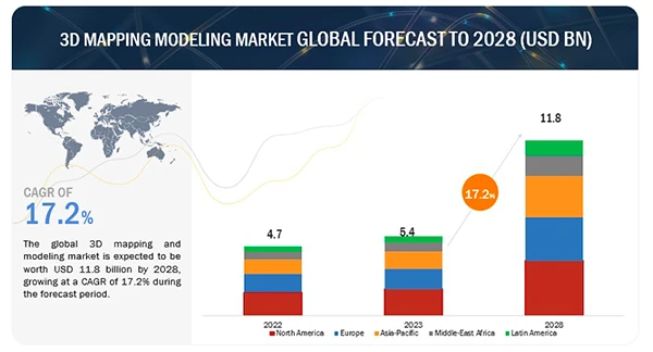
The graph below is an eye-opener for many businesses because the usage of the 3D mapping modeling market is set to grow exponentially in the coming years.
With the introduction of AI and automation, design firms and apps are leveraging technology to create more accurate representations of their reports.

Map Charts and You: Harnessing Its Power for Your Needs
Irrespective of your field or sector, there’s a possibility that you’re dealing with information that can be visualized using a geographical sketch. This tool could be potent in displaying complex patterns and trends, making your reports easier to understand and actionable.
Understanding your data’s geographical distribution can help reveal surprising insights, leading to smarter strategic decisions. When you’re analyzing sales stats, making public health decisions, or conducting scientific research, atlases can be beneficial.
If your reports have a geographical component, even if it’s not the primary focus, consider using a map chart to better visualize and understand your content.