“The secret of getting ahead is getting started.” – Mark Twain (American author, lecturer, and humorist)
Ready to jump into tech in 2026? We all have been there, staring at a blank resume, wondering how to prove our skills to the recruiters without spending four years of our lives in a university. This is where beginner-friendly programs 2026 come into the scene.
These programs will not just hand you a piece of paper; they will arm you with solid and real-world projects to showcase your talent. As Ralph Waldo Emerson said, “An ounce of action is worth a ton of theory.” Let’s get you taking action!
Key Takeaways
- Portfolio matters significantly more than simple connection certificates in 2026.
- Give priority to programs that end with a guided capstone project.
- Focus on mastering one tool (Tableau or Power BI) before jumping to another.
Factors to Consider Before Choosing a Beginner Program
Before you hand over your hard-earned cash or time, you need a proper game plan. Do not make the mistake of blindly picking a program. Here is what you must look for:
- Tool Relevance: Check if the top companies actually use the software that you are being taught.
- Hands-on Focus: Make sure that there are practical assignments instead of just endless lectures.
- Beginner Pacing: The curriculum that you should choose should be suited well for a fresher without causing burnout.
- Showcase your value: What you finally take away from the program should be something you can proudly add to your LinkedIn profile.
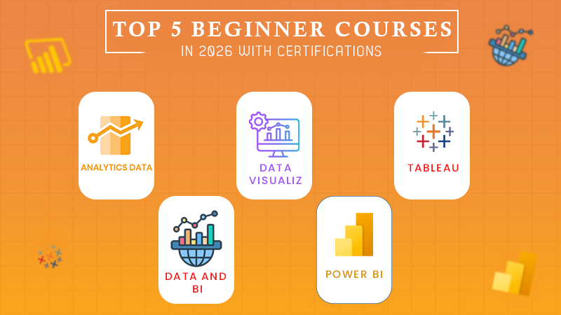
5 Online Beginner Courses with Certificates and Portfolio-Ready Projects in 2026
Now that you already know exactly what you need to look for, let’s check out the top five picks that will take you from absolute novice to a portfolio-weilding pro this year.
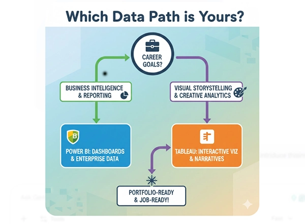
To make sure that you choose the right path for your specific career goals, take a look at this helpful visual breakdown.
1) Data Visualization and Analysis with Power BI – Great Learning Academy
When you enroll in this Power BI course, you are not just sitting back and passively watching videos. Instead, you are thrown into the deep end for your own benefit.
You’ll emerge with a stunning and interactive dashboard that centers around the real-world sports statistics, screaming professionalism to any hiring manager.
2) Microsoft Power BI Data Analyst Professional Certificate – Microsoft (Coursera)
Have you ever wished to learn from the actual creators of the software and wanted them to teach you their secrets? Microsoft designed this learning path to hold your hand through the entire data lifecycle.
By the end of the program, your capstone project will be polished, and you’ll feel confident enough to tackle actual corporate datasets.
Did You Know?
Power BI was not always called by this name; it was originally developed by Microsoft under the highly classified codename ‘Project Crescent.’
3) Tableau Data Visualization Essentials – Great Learning Academy
If you have a slight inclination towards visually stunning graphics, Tableau is your best friend. Jumping into this specific Tableau course will feel like a breath of fresh air.
It has its focus on storytelling, ensuring that the retail sales dashboard you build actually makes sense to non-technical individuals.
4) Data Visualization with Tableau Specialization – University of California, Davis (Coursera)
Taking it up a notch, UC Davis offers a rigorous path that prepares you to think like a true analyst at work.
You will tackle multiple projects that culminate in a beautiful, cohesive portfolio demonstrating your growth, designing skills, and critical thinking, ensuring you possess the professional polish required for top-tier data roles in 2026.
5) Data Analyst in Power BI – DataCamp Track
DataCamp gamifies the learning experience in an amazing way. This track feeds you bite-sized and interactive exercises that build your muscle memory.
You will quickly piece together small, repeatable projects that can serve as excellent conversation starters during interviews. It effectively proves your practical technical skills to any potential employer.
Fun Fact: The first Data Visualization was actually a map of the stars drawn in 1644, which was long before even Power BI existed!
Conclusion
People can enter the technology industry through their strategic work and dedication, and not with magical abilities. The successful completion of your outstanding project can lead to all additional work requirements coming to you.
You can begin exploring free online courses without cost to determine your interest before you decide on a specific field of study. Remember, every expert was once a beginner, and these specific programs are designed to bridge the gap with confidence.
FAQs
Ans: Yes, when they are paired with a tangible, portfolio-ready project to prove you can work.
Ans: No, these courses are especially designed for the ground for absolute beginners.
Ans: No! Free versions like Tableau Public and Power BI Desktop are enough.